Thursday, 15 December 2011

Radiohead - Kid A Final

 
Actors
Matt Davies
Catherine Ruane
Cameraman/Cinematography
Yassin Shahid
Director
Nikki-Leigh Rogers

Tuesday, 13 December 2011

What have you learned from your audience feedback?

Our audience feedback overall was very positive having gained the response that we aimed for. We filmed our classmate who thought the general atmosphere of the video was unique and disturbing creating an almost ‘Saw’ feel. This influenced us in the creation of a print-based work creating different colour schemes to increase this eerie feeling to our video. We have used a red and black scheme to connote mystery and further the evil ‘fetish’ theme in our video that we focused on. However we have also made alternatives cd covers with a black a grey theme to subtly indicate the main characters silent anger that is provoked throughout the video. We asked various different people which cd covers they preferred and were better suited to our video. We had a constructive response from the audience, which helped us decide which themes were more appropriate for a successful print base. The red and black theme overall deemed more popular as they felt that it complimented the disturbing effect in the video and emphasised it further. Another positive response from the audience was that the red theme connoted the potential buyer that the music would not be controversial and mainstream and would give the audience an insight visually to what they will be listening too. We also got optimistic feedback about the grey and black themes and some did prefer this, as it wasn’t so ‘obvious’ and emphasised the mysterious effect. However we felt that the best thing to do was to go ahead with the overall response.

We aimed to make a music video that was not mainstream and that would not be featured in the charts. This is because we wanted an opportunity to be more creative and abstract with our work. After people had watched our video they mentioned that it was hard hitting and unsettling. In the planning process I had looked at certain bands like ‘Jedi Mind Tricks’ and ‘Army of the Pharaohs’ that are very controversial with their work. We studied their cd covers and asked a few people from our class if their outgoing artwork would be appropriate for our work. We decided from the feedback that the cd cover should be simple and suggestive focusing on the themes instead of also having a ‘in your face’ print base as well as a video.

In our group we are lucky enough to have two members who also do graphics. This means that Katherine and Yassin can imply different artists techniques into the work to continue that eerie edge that we found the audience were impressed with. This also gave our work a more professional look that our classmates had also commented on. This audience feedback helped us go all out with our print base in confidence and allowed us to achieve a successful cd case and advert that complimented our genre and themes of the video.

In what ways does your media product use, develop or challenge forms and conventions of real media products?

The 6 conventions Goodwin had, that music videos generally follow were
1. Music videos demonstrating genre characteristics
2. A relationship between lyrics and visuals, the lyrics representing the lyrics through images
3. A relationship between music and visuals, the tone and atmosphere suiting the music
4. Many close ups of the artist (to meet the demands of the record label)
5. Frequent reference to the notion of looking and particular voyeuristic treatment of the female body
6. Intertextual references to films, Tv programmes etc.

We followed the first three of the 6 Goodwin conventions however vaguely followed the latter three, our genre was an alternative rock/electronica genre, therefore we decided to come up with an idea that was unique, and really quite 'alternative' for a music video. The song really is quite a unique song therefore we had to think of an idea to fit the music and lyrics of this song, following convention 2 and 3. We believed the first three conventions to be the most important conventions as they really define a music video, and to emphasize the mood the song creates is what we believe music videos should do. However the latter 3 conventions we didn't find as important so we only followed those conventions if it was necessary to do so in order to fit the first 3 conventions.

We included close ups of the artist only to fit the slight narrative aspect of the music video, and we only focused on referencing the notion of looking to fit the atmosphere, for example with POV shots and with the shot of the main character appearing at the end of the bed, this is in the Point of view of the person sleeping, in order to fit the sinister mood of the song, and the lyrics of the song. We didn't include any intertextual references in the music video to any other films or TV programs with intention as that wasn't what we believed was important about the music video. The main reason why we chose not to use close ups in order to promote the artist, or used intertextual references to any media outside of the music video is for the reason that in doing a song like this one we chose to isolate ourselves from the real world, and from anything that seemed normal, as our full intention with this music video was to focus on the surrealistic and the delusive.

We used simple, yet abstract ideas such as a small light brightening and a man stood in a city with the public fluttering past, along with the sky darkening for the sole reason to connect with the mind through the medium of music and moving image. This is something new if we are speaking in the terms of mainstream music videos as the mainstream music industry is a lot like a business, using music videos to promote the artist rather than to express the music and maintain the atmosphere of the song through image, we decided to break from the convention of promoting the artist to do something a little more unique.

How did you use media Technologies in the construction, research, planning and evaluation stages?


During our production we used technology in many different ways including Studio lights to create an eerie environment and a camera crane for interesting shots. We used a standard canon camera, the main ability this camera had was being able to manually focus and we used this in one of our scenes. It was also easy to use, and very versatile. The tripod we had along with it helped us to keep it still when filming, it also helped panning and tracking shots to be a lot smoother. We did have a problem with the camera once however when we attempted to film the doll breaking on the floor. We originally intended the doll to break in slow motion, however because of the low frames-per-second of the camera; we couldn’t slow the shot down as it appeared jittery.

We mainly used Final Cut Pro to do the video editing and Adobe Audition for audio editing, we used Final Cut Pro also for the visual effects, which we believed added to the atmosphere of the song. Final Cut Pro allowed us to speed up the timeline of the video to create the time-lapse effect.  Also to add to the dark, dreamlike, surreal atmosphere we used some other effects supplied by Final Cut Pro, Vignette was one effect, making the video de-saturated. Another effect used was blurring the corners to give the music video more of a cinematic feel. Bad Film was the final effect we used giving the overall mysterious, dreamlike effect. This effect also added to the hypnotic aspect of the music video we tried to create. Adobe Audition was used to edit the song, as we had the problem of the song being 4:30, so we had to cut out a minute of the song. We managed to do this in cutting the least important parts of the song while still trying to keep the song flowing and natural-sounding.

We used the studio in college with the aim of filming the scenes inside a dark room because that had all the studio lights and technology we needed along with blackout curtains to make sure the room was as dark as it can be. It also had a speaker that we used to play the song ‘Kid A’ through to make sure all our ideas fit the mood and atmosphere of the music. It also helped with the acting as then the music would have signalled our thought processes to match the music with acting.

For the CD Cover we used 2 programs, both Adobe packages, these were both illustrator and Photoshop. To achieve the 2 circles of text on the inner right side cover we used Illustrator. Photoshop was then used to create the cover art by collaborating different photos, typography and textures.

In order to research for our main project, we used safari on the Apple Mac’s, and from that we mainly looked at the website ‘Youtube’ for inspiration, looking at other music videos. This inspired our time-lapse idea mainly. Also to buy the dolls we used the website ‘Ebay’, these were then used as our main props.

Friday, 9 December 2011

Narrative analysis

The narrative in our music video is mainly linear however contains some non-linear features including parallel editing between past and present. The beginning of the main narrative running through the video is of the main character in a room pacing up and down and planning his move on his next victim with inanimate dolls. This includes the main character at a table 'playing' with these dolls, sitting on a chair, walking back and forth. The middle of the narrative is of the main character finding his victim in a city, this includes the time-lapse scene of the main character standing on a street along with the alleyway scene. The narrative then ends with the main character and the victim back in the room.

In the beginning of the music video there are non-linear features mainly to amplify the sound and mood of the music. For example with the hurried part at the beginning of the song once the chiming intro ends, we skipped to the present for the time-lapse scene of standing on a street with people fluttering past as it fit the mood of the music. This was the same with the scene of the main character sitting on a chair, which was actually a rewind in time from the time-lapse scene. We chose this scene because it fit with the part of the song. However after the alleyway scene the narrative of the music video is linear until the end. We decided not to use any performance in the music video as we believed it wouldn't fit the abstract nature and tone of the music.


Thursday, 8 December 2011

Representations in our music video

Representations are always very subtle in music videos, however there is always a stereotypical representation of something, whether it be gender, race or age. We could not confirm or break any age stereotype in our music video as every character in the video is of the same age as another. We did confirm many gender stereotypes however, as the male gender in our music video is shown to be strong and dominant, whereas the female gender is shown as a weak victim. This is shown as the main character is the one hunting the female victim and tying her up. Also the main character is a white male which is very typical of the sort of gender and race who are known to listen to 'Radiohead'. Therefore it confirms stereotypes of both gender and race.

There could also be a representation of the mentally disabled in the music video assuming the main character has mental issues. This is represented negatively yet powerfully in the music video. It is negative as the main character causes damage and causes a death if interpreted in this way. Also it is represented very sinisterly. This connotes the fear of the surreal and unknown within everyone.

How effective is the combination of your main product and ancillary texts (the magazine advert and CD digipak)?

Our music video as a whole has an avant-guard and unique quality about it. It doesn’t follow certain stereotypes of regular/mainstream videos. The style of the video reflects the music very well in a way, which the lyrics have been interpreted to show the viewer a hidden story beneath the lyrics. The CD cover and inside panels compliment the video in an expressive way. By using a limited amount of colours throughout the CD packaging gives it an understated look, but the colours used gives it a sense of vagueness and uncertainty. Like our video, our CD cover and inside panels don’t follow certain stereotypes the industry gives out. Like having the band members faces on the front of the cover, intriguing potential consumers of a mainstream interest. Also we didn’t use just a simple photograph on the front, we used filters and several other effects to give the cover a distinctive quality and style about it. With our magazine advert we tried to relate it to the CD cover and inside panels as much as we could, as it would be highly recognizable to the potential consumer if they both looked similar and both related to the video. Using the same image on both the CD cover and the advert makes it easy for potential consumers to familiarize them selves with the imagery. Also by using the same colour palette of a limited few colours adds to the familiarization the consumer will have with both the video, CD and advert. The output of the CD cover and inside panels will interest the public by looking different and having a uniqueness about it and it will also intrigue controversial consumers who are interested in things that are different. The similar advert will interest people who are not big fans of Radiohead its self but just seeing the advert could interest someone who likes the graphical look to it and the colours used which could intrigue anyone who are interested in the controversial art scene. The choice of text used throughout the digipak represents the style of music, the hands on and original style compliments the style trying to be portrayed throughout. Over all the 4 CD panels and the magazine advert compliment the video to a point where they all link and flow easily together and are all easily recognizable from one to the other.

Wednesday, 7 December 2011

Analysis of Music Video using Craig Davis' model

We decided to have a combination of illustration, amplification and disjuncture in our music video, we included a slight narrative within the video however the narrative was disjunct as it had no obvious link to the theme or lyrics of the song, mainly as the song actually has no obvious theme in it either. The narrative is mainly used as amplification to the music. Therefore the song is a mix of all music video categories. We used amplification with the idea of the dolls with the chiming sound in the beginning of the song as this part of the song has an innocent yet sinister feel, as with a doll. Then as the lower bass instruments begin in the song we decided to use a time-lapse as it fits the more hurried feel in the music. Also the brightening light idea was to fit the slower, expanding sound in the music.

The narrative in the music video we chose to fit the sound, and link our ideas together was of the main character being obsessed with dolls, and hunting out victims. The reason he is hunting these victims is open for interpretation, depending on what the audience thinks. It could be the more surreal reason of turning them into dolls, the main character could have a doll fetish or he could plainly just be doing it to kill them, and the dead victim could then be lifeless like a doll. In the video it is showing the main character planning and scheming back in his room with dolls, while he is hunting his victim and capturing her in an alleyway. The video then goes on to show the main character tying up this victim, dropping a doll, the doll smashing, ending with a shot of a doll in place of the victim. This is an abstract narrative as it doesn't link clearly to the theme of the song. This is as the song doesn't really have a narrative.

There are some scenes used in the music video to link with the lyrics of the song, for example with "Standing in the shadows at the end of your bed", in other lyrics such as "we've got heads on sticks" and "the rats and children follow me out of town". Our music video is really to amplify those ideas and for the listener to interpret them differently, for example 'head's on sticks' could reference the dolls, as sticks are inanimate objects and the main character could believe they are living objects, and head's are something that are alive. Also 'the rat's and children follow me out of town' could be a reference to the Pied Piper, which could represent the main character and the victim could be interpreted as following him back to the room this way, seduced by something surreal the main character has within him. For example we give an idea of surreality with the main character reappearing in a different place in the alleyway the victim is caught in.

Saturday, 3 December 2011

Photoshop Effects

To make the final CD Cover art I had to use a couple of effects to make it look the best it could.


CD Cover Typography

I wanted the CD Cover to have a rough look to it to go with the video so I used some Graphics equipment to get some typography using letter blocks.


Final Cut Pro Effects

During Production we added some effects to the video to make it more darker

We first added the Bad Film effect which added gitteryness

The we also added Vignette which made the corners darker and the video desaturated

Thursday, 1 December 2011

Magazine Advert

Done by Catherine

To have continuity between the CD Cover and the Magazine advert Catherine used the colour scheme and elements of the CD Cover.

Analyzing CD covers:


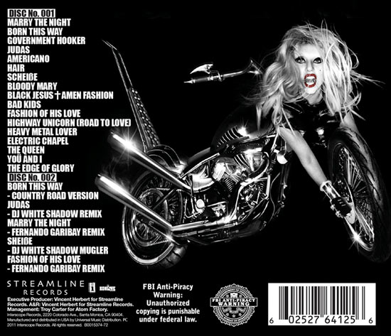
Lady Gaga – Born This Way:

Lady Gaga is a mainstream artist who has obvious high demands off her record company to have close ups of her face on everything she does, including her CD covers. For her latest album Born This Way the shock factor was used to interest all different types of people, weather they liked the front cover or not, they were still talking about it, something that is necessary for a artist as big as her. Her reputation is kept in tact, as she is well known for her avant-garde style and appearance the cover followed this up. The image used on the front cover expresses the image she wants to portray to the world. The fact that only her face is on the cover shows that its was made to be eye catching and noticeable. The album name and artists name are secluded in the top corner to not distract from the image. The back of the album shows more of the image on the front cover, reveling a motorbike attached to Gaga, showing a deep meaning within the album. With the theme of the CD cover being black + white the white text stands out on the black background without distracting from the image. The text includes the track listing, the name of the company that made the album, the executive producers and manager. The barcode is also on the back of the album, something we will include in ours.

Analysis of magazine adverts in detail:

Radiohead – King of Limbs:

This advert is advertising and encouraging the download of this album, which shows the change in not just the recording industry but the new technology and high quality of this technology being upgraded on a day-to-day basis. The image used does not reflect the music that this band creates, their uniqueness and individuality is not expressed in the advert, which is almost disappointing and misleading for the potential consumer. The image includes all the band member that is important but I wouldn’t of expected this of such a individual, avant-garde band. The text is again bold and gets straight to the point. The most important things are not included in the advert, including where you can download it from and when it is available to download. Overall the advert is simple and straight to the point although a few things are missed out, it would catch the eye of potential consumers by the rainbow of colour’s and the encouraging words used.

Analysis of magazine adverts in detail:


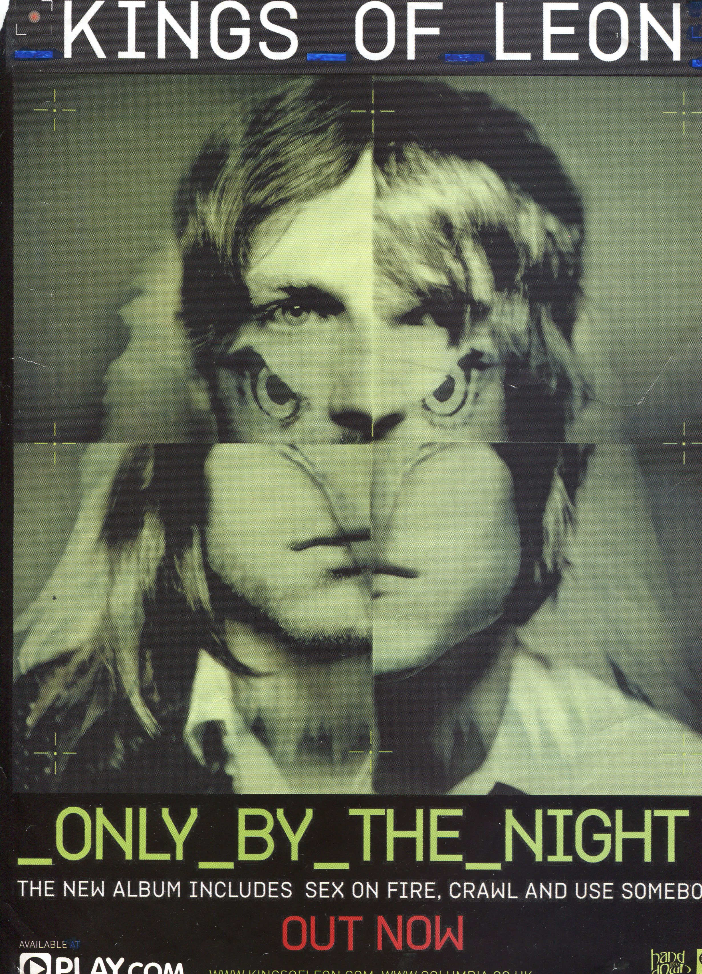
Kings of Leon – Only by the night:

The designer of this advert has used the picture on the front of the CD cover for the advert; this is so it is easily recognizable to the reader/consumer. All the members of the band are in this picture although the designer has mixed in a bird and only used parts of each member’s faces, which gives the image a unique quality. The text is bold and straight to the point, it includes the name of the band, the name of the album, the hit songs that are included in the album that might intrigue consumers and where you can purchase it from, and most importantly when it is out. The overall advert has a quality about it that makes it not mainstream, not something that will interest a small audience but something in between, it is easily accessible to all. The colour’s used gives the advert a vintage/classic look which is an up to date trend surrounding all aspects of the arts.